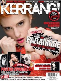
Kerrang!
I really like this magazine cover for kerrang magazine, this is because of how the conventions are used. This magazine cover inspires me because it matches to the genre of magazine that I was considering doing. The colour scheme used for this particular cover is black, red and white which really stand out against each other giving the magazine a contrast. Furthermore the colours have connotations of danger and darkness which reflects on the genre of music. I really love the cluttered effect used on the front cover it shows there is a lot to read about; also it makes it extremely eye-catching to the reader and immediately stands out above other magazines. I think the target audience for this magazine cover is probably teenagers to young adults (15-25 years old) which is the round about the audience I would like to base my magazine on. finally I would say this magazine inspires for for the fact that it sticks to the usual magazine conventions only making them more 'in your face' and more vibrant.
NME
This magazine really inspires me because I really like the use of the photography used, it is direct to the audience and makes it look like the band is looking directly at the audience, I like this because it makes it more attractive to the readers eyes and this is something i would defiantly use when producing my magazine cover. I really love the colour scheme used on this cover because the masthead really stands out in the bright red with the white and black outline. furthermore I like how the band is slightly covering the masthead because it shows the magazine is well established and the reader will recognise this and know it is a good quality magazine. Another convention from this front cover I like is the font, size and colour of the main title, this is because the yellow really 'pops' on top of the image of the band and if the audience likes this band then it will appeal to them hugely. Moreover the subhead also adds to the main cover line with the use of the colours as the yellow stands out on top of the red. finally I think the main image swamps the page a bit and makes it to crowded however i do like the image i think i would have had it further in the distance.
Q
I think that this magazine cover would stand out over the rest because mostly of the masthead it is in the left corner and it flows as if you were reading a book so it is the first thing that the reader will look at. The tagline is a really nice touch (discover great music) because it makes it sound like its the best music magazine to buy. the photography used here to me is really outstanding and extremely eye-catching. I love the use of the photo shoot style and how she is looking directly at the reader making it seem more personal like it was made just for the reader. I love Florence's hair here it stands out and the writing used over the top is in white so it is clear and easy to read. my favourite part of this cover is the use of the pull quote I think this drags the reader in because they get to know part of the story and want to read on (giving them a taste of whats inside) I would like to use this when producing my magazine because I think its a good persuasive technique.


No comments:
Post a Comment